SwiftUI Theme Kit
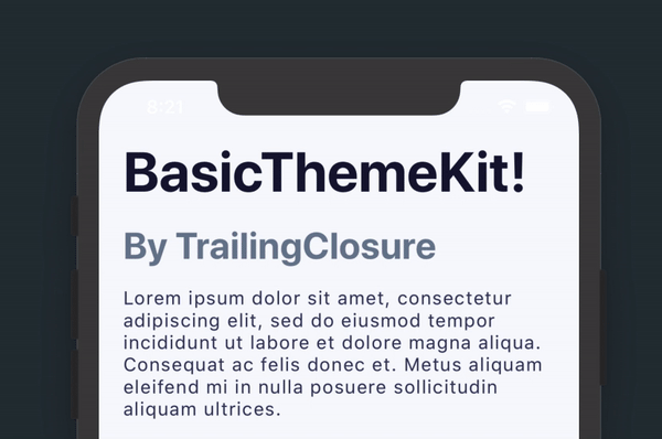
BasicThemeKit is a SwiftUI package that allows you to quickly format elements in your app around a common theme. All of the elements in the kit are made as a ViewModifier with an extension to View. This allows you to prototype quickly and maintain the readability of your code.
Text
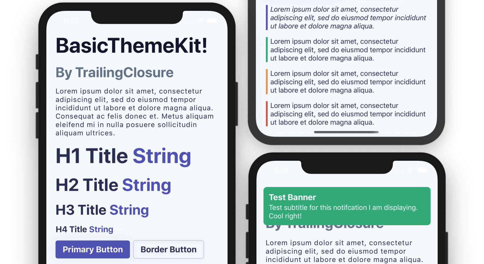
// H1 Header
Text("H1 Header String")
    .h1()

// H2 Header
Text("H2 Header String")
    .h2()

// H3 Header
Text("H3 Header String")
    .h3()

// H4 Header
Text("H4 Header String")
    .h4()

// Paragraph Styling
Text("This creates text formatted for a paragraph.")
    .paragraph()
Buttons
// Primary Button
Button(action: {}) {
    Text("Primary Button")
        .primaryButton()
        .h4() // You can use text styling on buttons too!
}

// Border Button
Button(action: {}) {
    Text("Border Button")
        .borderButton()
        .h4()
}
Block Quote
// Block Quote - Primary Styling
Text("Lorem ipsum dolor sit amet, consectetur adipiscing elit, sed do eiusmod tempor incididunt ut labore et dolore magna aliqua.")
    .paragraph()
    .blockQuote(style: .Primary)
/*
Other Styles:
    - .Success
    - .Warning
    - .Error
*/
Notification Banner
// Change the bool value to toggle display of the Notification banner.
@State var bannerVisible: Bool = false

ZStack {
    // All of your normal content in here.
}
.banner(title: "Test Banner", subtitle: "Test subtitle for this notifcation I am displaying. Cool right!", style: .Primary, isVisible: $bannerVisible)

// Banner will automatically hide after a few seconds. That is why the bool value is passed as a binding.
/*
Other Styles:
    - .Success
    - .Warning
    - .Error
*/
Setup
Install as a Swift Package using the link for this git repository.
https://github.com/jboullianne/BasicThemeKit.git
Support Future Projects
If you enjoyed this post, please consider subscribing using this link. New tutorials are updated weekly, in addition to resources for you to use in your next project!