For this tutorial we're going to create a custom UIButton class which toggles it's look when the user taps the button. We're going to also make this custom class an IBDesignable so that it may be editable from within the Storyboard editor.
Creating the Custom Class
import UIKit

@IBDesignable class SelectionButton: UIButton {


}
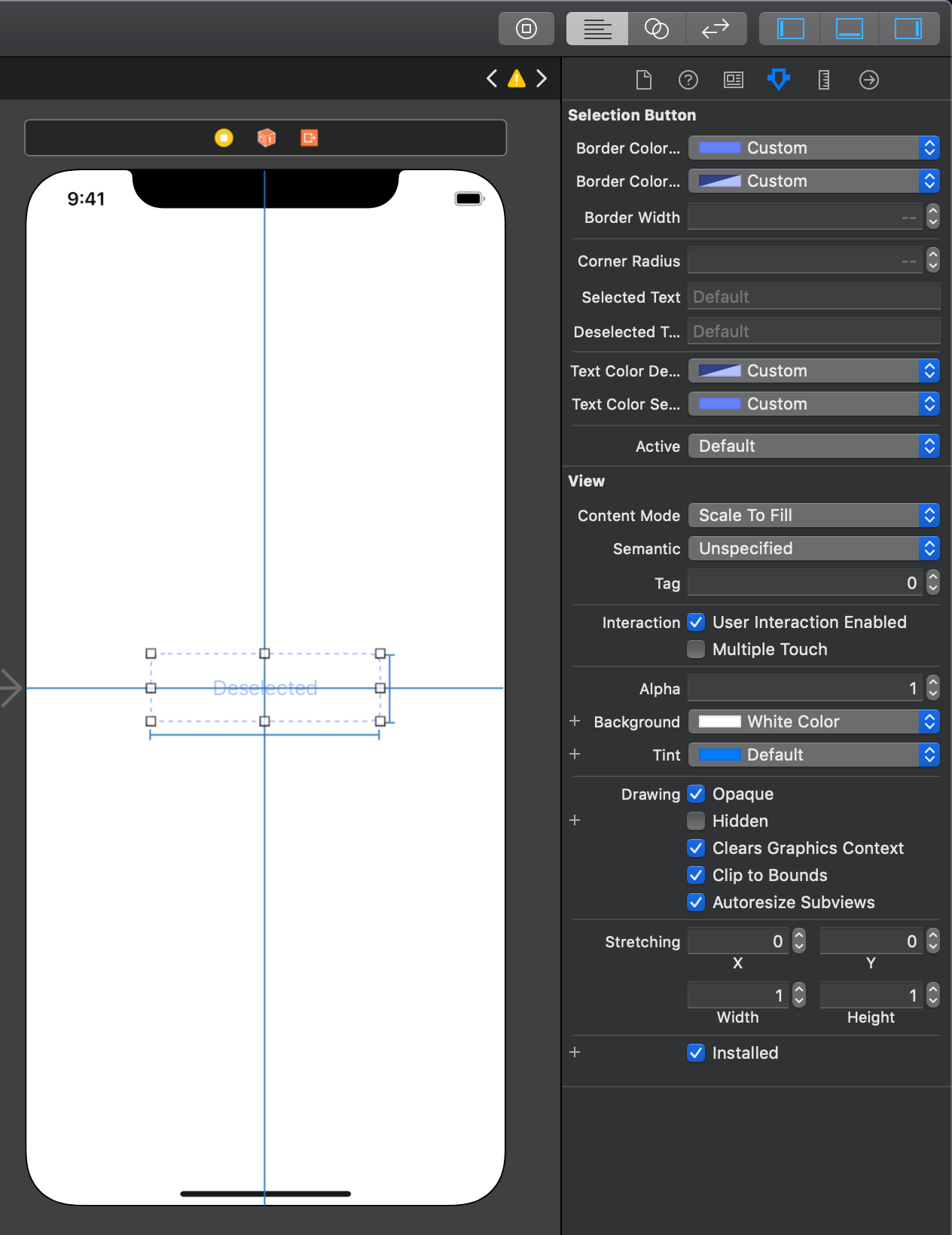
This creates a custom class called SelectionButton which is also an IBDesignable. from here we will need create a few IBInspectable variables which will be the basis for our custom button's look and feel.
Adding the @IBInspectable Variables
import UIKit
@IBDesignable class SelectionButton: UIButton {
// Allows developer to edit what colors are shown in each state
@IBInspectable var borderColorSelected:UIColor = UIColor.purple
@IBInspectable var borderColorDeselected:UIColor = UIColor.purple
// Width of Dashed/Solid Border
@IBInspectable var borderWidth:CGFloat = 3
// Radius of corners of the button
@IBInspectable var cornerRadius:CGFloat = 10
// The text that's shown in each state
@IBInspectable var selectedText:String = "Selected"
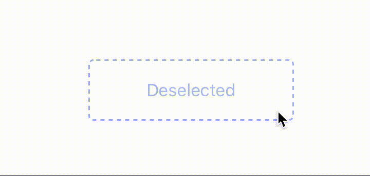
@IBInspectable var deselectedText:String = "Deselected"
// The color of text shown in each state
@IBInspectable var textColorDeselected:UIColor = UIColor.lightGray
@IBInspectable var textColorSelected:UIColor = UIColor.black
// Sets the Active/Inactive State
@IBInspectable var active:Bool = false
}
Here we've added a few variables for properties such as border color, border radius, text, text colors, and whether the button is going to be active or in-active. In this next part we're going to utilize these variables in our custom draw function.
Overriding the Draw Function
Start by overriding the draw function as shown below.
override func draw(_ rect: CGRect) {
    // Our custom drawing code will go here...
}
Then above the draw function, create a class variable for our border. For this we will be using a CAShapeLayer.
// Custom Border to the UIButton
private let border = CAShapeLayer()

override func draw(_ rect: CGRect) {
    // Our custom drawing code will go here...
}
Next start by modifying the properties of the CAShapeLayer as such.
// Custom Border to the UIButton
private let border = CAShapeLayer()

override func draw(_ rect: CGRect) {

    // Setup CAShape Layer (Dashed/Solid Border)
    border.lineWidth = borderWidth
    border.frame = self.bounds
    border.fillColor = nil
    border.path = UIBezierPath(roundedRect: self.bounds, cornerRadius: cornerRadius).cgPath
    self.layer.addSublayer(border)

    self.layer.cornerRadius = cornerRadius
    self.layer.masksToBounds = true

}
In the first four lines we set the borderWidth utilizing our @IBInspectable property from earlier, then set the borders frame to that of our button. Thirdly, we set the fillColor to nil (this will allow the background color of the UIButton to shine through). Finally we set the path of the border to be around our button, to include the custom corner radius from our @IBinspectable property above.
The last two lines set the corner radius of the button (we already set the corner radius of the custom border), and then tell the button to mask anything outside of the that custom corner radius.
Configuring the Selected and Deselected States
We're going to create two functions: setSelected, and setDeselected.
They're going to update the properties of the border, depending on the state of the button.
// Set the selected properties
func setSelected() {
    border.lineDashPattern = nil
    border.strokeColor = borderColorSelected.cgColor
    self.setTitle(selectedText, for: .normal)
    self.setTitleColor(textColorSelected, for: .normal)
}

// Set the deselcted properties
func setDeselected() {
    border.lineDashPattern = [4, 4]
    border.strokeColor = borderColorDeselected.cgColor
    self.setTitle(deselectedText, for: .normal)
    self.setTitleColor(textColorDeselected, for: .normal)
}
What does each line do?
The first sets the dashed pattern on the border. nil sets the border to be solid, whereas [4, 4] sets the border to have a 4 user-space-unit-long painted segment, and then a 4 user-space-unit-long unpainted segment.
The second sets the border's color. Again thee are using the @IBInspectable properties we created in the first part of the tutorial.
The final two lines set the text on the button as well as the text color.
The Full Completed Class
//
//  SelectionButton.swift
//  PrototypeViews
//
//  Created by Jean-Marc Boullianne on 8/18/19.
//  Copyright © 2019 Jean-Marc Boullianne. All rights reserved.
//

import UIKit

@IBDesignable class SelectionButton: UIButton {

    // Allows developer to edit what colors are shown in each state
    @IBInspectable var borderColorSelected:UIColor = UIColor.purple
    @IBInspectable var borderColorDeselected:UIColor = UIColor.purple

    @IBInspectable var borderWidth:CGFloat = 3
    @IBInspectable var cornerRadius:CGFloat = 10

    // The text that's shown in each state
    @IBInspectable var selectedText:String = "Selected"
    @IBInspectable var deselectedText:String = "Deselected"

    // The color of text shown in each state
    @IBInspectable var textColorDeselected:UIColor = UIColor.lightGray
    @IBInspectable var textColorSelected:UIColor = UIColor.black

    // Sets the Active/Inactive State
    @IBInspectable var active:Bool = false

    // Custom Border to the UIButton
    private let border = CAShapeLayer()

    override func draw(_ rect: CGRect) {

        // Setup CAShape Layer (Dashed/Solid Border)
        border.lineWidth = borderWidth
        border.frame = self.bounds
        border.fillColor = nil
        border.path = UIBezierPath(roundedRect: self.bounds, cornerRadius: cornerRadius).cgPath
        self.layer.addSublayer(border)

        self.layer.cornerRadius = cornerRadius
        self.layer.masksToBounds = true

        // Setup the Button Depending on What State it is in
        if active {
            setSelected()
        } else {
            setDeselected()
        }

        // Respond to touch events by user
        self.addTarget(self, action: #selector(onPress), for: .touchUpInside)
    }

    @objc func onPress() {
        print("Button Pressed")
        active = !active

        if active {
            setSelected()
        } else {
            setDeselected()
        }
    }

    // Set the selected properties
    func setSelected() {
        border.lineDashPattern = nil
        border.strokeColor = borderColorSelected.cgColor
        self.setTitle(selectedText, for: .normal)
        self.setTitleColor(textColorSelected, for: .normal)
    }

    // Set the deselcted properties
    func setDeselected() {
        border.lineDashPattern = [4, 4]
        border.strokeColor = borderColorDeselected.cgColor
        self.setTitle(deselectedText, for: .normal)
        self.setTitleColor(textColorDeselected, for: .normal)
    }

}
Remember since the class utilizes @IBDesignable and the @IBInspectable properties, we can edit the view without any code in the Storyboard Editor.