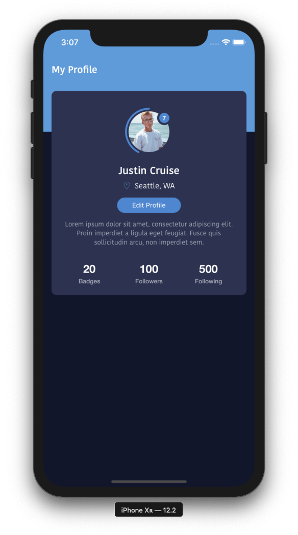
Have you ever wanted to create a user icon similar to ones on Instagram or Facebook's iOS apps? An icon with notification alert as well as a status border?
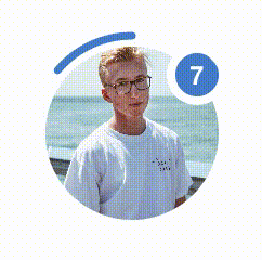
Take a look at our version of the popular style, and feel free to use within your own custom apps. Source code is provided at the end of the page.
Download source code from GitHub
//
//  UserStatusView.swift
//  MFProfileExample
//
//  Created by Jean-Marc Boullianne on 9/1/19.
//  Copyright © 2019 Jean-Marc Boullianne. All rights reserved.
//

import UIKit

@IBDesignable class UserStatusView: UIView {


    @IBInspectable var textColor:UIColor = .white
    @IBInspectable var borderColor:UIColor = UIColor(red: 78/255, green: 134/255, blue: 208/255, alpha: 1.0)
    @IBInspectable var alertColor:UIColor = UIColor(red: 78/255, green: 134/255, blue: 208/255, alpha: 1.0)
    @IBInspectable var iconBackgroundColor:UIColor = UIColor(red: 18/255, green: 22/255, blue: 43/255, alpha: 1.0)

    @IBInspectable var image:UIImage = UIImage() {
        didSet {
            self.iconView.image = self.image
        }
    }

    // How far border will wrap around icon
    @IBInspectable var borderValue:CGFloat = 0.7 {
        didSet {
            if self.borderValue > 1.0 {
                self.borderValue = 1.0
            } else if borderValue < 0 {
                self.borderValue = 0
            }
            borderLayer.strokeEnd = borderValue
        }
    }

    // Amount of Notifications to display
    @IBInspectable var notifications:Int = 0 {
        didSet{
            if self.notifications == 0 {
                nLabel.isHidden = true
            }
            nLabel.text = "\(self.notifications)"
        }
    }

    lazy var borderLayer:CAShapeLayer = CAShapeLayer()
    lazy var nLabel:UILabel = UILabel()
    lazy var iconView:UIImageView = UIImageView()

    // Only override draw() if you perform custom drawing.
    // An empty implementation adversely affects performance during animation.
    override func draw(_ rect: CGRect) {
        self.layer.cornerRadius = rect.height/2.0
        self.clipsToBounds = true

        // Setup Notifications Label
        nLabel.clipsToBounds = true
        nLabel.frame = CGRect(x: frame.width - 30, y: 13, width: 20, height: 20)
        nLabel.layer.cornerRadius = 10

        // Setup User Icon with margin inside entire view (leave room for status border)
        let iconMargin:CGFloat = 10
        iconView.frame = CGRect(x: iconMargin, y: iconMargin, width: rect.width - (2*iconMargin), height: rect.height - (2*iconMargin))
        iconView.layer.cornerRadius = (rect.height - (2*iconMargin)) / 2.0

        let path = UIBezierPath(arcCenter: CGPoint(x: rect.midX, y: rect.midY), radius: rect.width/2.0 - 5, startAngle: -1 * CGFloat.pi / 2.0, endAngle: (CGFloat.pi * -2.0) - (CGFloat.pi/2.0), clockwise: false)

        borderLayer.path = path.cgPath
        borderLayer.strokeColor = borderColor.cgColor
        borderLayer.strokeStart = 0
        borderLayer.strokeEnd = borderValue
        borderLayer.lineWidth = 3.5
        borderLayer.backgroundColor = UIColor.clear.cgColor
        borderLayer.fillColor = UIColor.clear.cgColor
        borderLayer.lineCap = .round

        // Show the notifications label depending on amount of notifications
        if self.notifications != 0 {
            let iconMaskPath = UIBezierPath()
            iconMaskPath.move(to: CGPoint(x: 0, y: rect.height/2.0 - iconMargin))

            iconMaskPath.addArc(withCenter: CGPoint(x: rect.midX - iconMargin, y: rect.midY - iconMargin), radius: rect.width/2.0 - 5, startAngle: -2 * CGFloat.pi / 2.0, endAngle: -1 * CGFloat.pi / 2.0, clockwise: true)

            iconMaskPath.addArc(withCenter: CGPoint(x: frame.width-30, y: 13), radius: 14, startAngle: -1 * CGFloat.pi / 2.0, endAngle: 0, clockwise: false)
            iconMaskPath.addArc(withCenter: CGPoint(x: rect.midX - iconMargin, y: rect.midY - iconMargin), radius: rect.width/2.0 - 5, startAngle: 0, endAngle: -2 * CGFloat.pi / 2.0, clockwise: true)
            iconMaskPath.close()
            let maskLayer = CAShapeLayer()
            maskLayer.path = iconMaskPath.cgPath
            self.iconView.layer.mask = maskLayer
        }

        self.layer.insertSublayer(borderLayer, at: 0)
    }


    override init(frame: CGRect) {
        super.init(frame: frame)
        self.setupViews()
    }

    required init?(coder aDecoder: NSCoder) {
        super.init(coder: aDecoder)
        self.setupViews()
    }

    func setupViews() {
        nLabel.text = "\(notifications)"
        nLabel.backgroundColor = alertColor
        nLabel.textColor = textColor
        nLabel.textAlignment = .center
        nLabel.font = UIFont(name: "HelveticaNeue-Bold", size: 12)

        iconView.clipsToBounds = true
        iconView.contentMode = .scaleAspectFill
        iconView.backgroundColor = iconBackgroundColor

        self.addSubview(iconView)
        self.addSubview(nLabel)

        self.backgroundColor = .clear
    }
}