AsyncButton StatesWelcome back! This week's posts cover an assortment of SwiftUI micro-interactions that I've made for my apps. The benefits these interactions bring can really help make your app feel polished and simple to use. Today's micro-interaction tutorial covers creating a custom button for asynchronous tasks such as downloading, sending, or loading data.
If you found this tutorial helpful, please consider subscribing using this link, and if you aren't reading this on TrailingClosure.com, please come check us out sometime!
Creating AsyncButton
Before we get programming, let's explain the different states of AsyncButton.
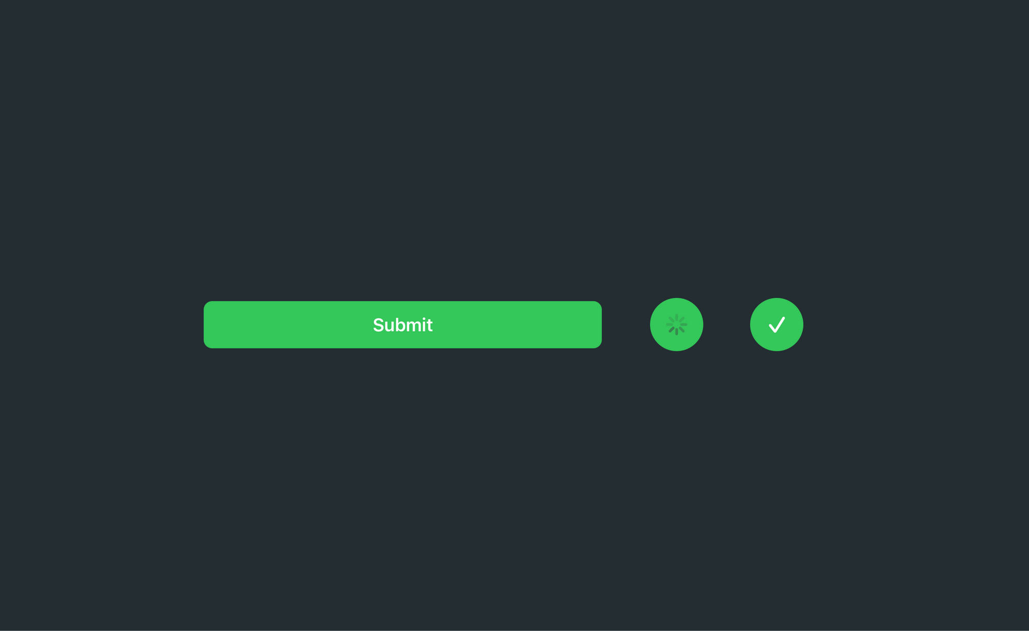
inactive- User has not started asynchronous taskinProgress- Actively processing asynchronous taskisComplete- Asynchronous task complete
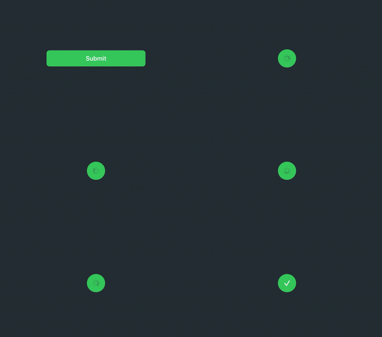
During each of these states, the AsyncButton will show a different View describing the asynchronous task. Pictures below:


Getting Started
Below is the template for our AsyncButton which includes properties for the states described above. We're going to focus on programming the views for the different states. If you're curious about how the init function works or what @ViewBuilder is, then I encourage you to check out Majid Jabrayilov's (@mecid) post on the power of @ViewBuilder property wrapper in SwiftUI.
struct AsyncButton<Content: View>: View {

    var isComplete: Bool
    let action: ()->()
    let content: Content

    @State private var inProgress: Bool

    init(isComplete: Bool, action: @escaping ()->(), @ViewBuilder label: ()->Content) {
        self.action = action
        self.isComplete = isComplete
        self.content = label()
        self._inProgress = State.init(initialValue: false)
    }

    var body: some View {
        Button(action: {
            // Call Async Task and update View
        }, label: {
            // Show the different state views
        })
    }


}
Programming the different view states
Inside the label: closure, we're going to start off by utilizing VStack to group all of the different state views. I chose a VStack specifically for animating the AsyncButton state changes. If we set the alignment of the stack to .center then the new views will animate from the center of the button, making it seem like the button is resizing itself.
struct AsyncButton<Content: View>: View {

    var isComplete: Bool
    let action: ()->()
    let content: Content

    @State private var inProgress: Bool

    init(isComplete: Bool, action: @escaping ()->(), @ViewBuilder label: ()->Content) {
        self.action = action
        self.isComplete = isComplete
        self.content = label()
        self._inProgress = State.init(initialValue: false)
    }

    var body: some View {
        Button(action: {
            // Call Async Task and update View
        }, label: {
            // Show the different state views
            VStack(alignment: .trailing) {
                if inProgress && !isComplete {
                    ProgressView()
                        .foregroundColor(.white)
                } else if isComplete {
                    Image(systemName: "checkmark")
                        .resizable()
                        .frame(width: 15, height: 15, alignment: .center)
                        .foregroundColor(.white)
                } else {
                    content
                }
            }
        })
    }


}
Above you'll see as the state of the button changes, we return different views such as the ProgressView, and Image, and content which is provided when instantiated.
Updating Button State
When the user taps the AsyncButton we want to make sure we do two things:
- Call the action closure which was passed by the developer during instantiation.
- Update the state of the
AsyncButtonby updating theinProgressproperty.
var body: some View {
        Button(action: {
            // Update Button State, and call passed `action` closure
            if !inProgress { action() }
            withAnimation(Animation.easeInOut(duration: 0.4)) {
                inProgress = true
            }

        }, label: {
            VStack(alignment: .trailing) {
                if inProgress && !isComplete {
                    ProgressView()
                        .foregroundColor(.white)
                } else if isComplete {
                    Image(systemName: "checkmark")
                        .resizable()
                        .frame(width: 15, height: 15, alignment: .center)
                        .foregroundColor(.white)
                } else {
                    content
                }
            }
        })


    }
Adding Styling
Below, I added some styling to the AsyncButton, but I encourage you to play around with it and modify it to suit your app's theme or style.
var body: some View {
    Button(action: {
        if !inProgress { action() }
        withAnimation(Animation.easeInOut(duration: 0.4)) {
            inProgress = true
        }

    }, label: {
        VStack(alignment: .trailing) {
            if inProgress && !isComplete {
                ProgressView()
                    .foregroundColor(.white)
            } else if isComplete {
                Image(systemName: "checkmark")
                    .resizable()
                    .frame(width: 15, height: 15, alignment: .center)
                    .foregroundColor(.white)
            } else {
                content
            }
        }
        .frame(maxWidth: isComplete || inProgress ? 50 : .infinity, maxHeight: isComplete  || inProgress ? 50 : nil, alignment: .center)
        .padding(.vertical, isComplete  || inProgress ? 0 : 12)
        .foregroundColor(.white)
        .background(Color.green)
        .cornerRadius(isComplete || inProgress ? 25 : 8)
        .font(Font.body.weight(.semibold))
        .padding(.all, 20)
    })


}
Using the AsyncButton (Examples)
Our first example shows how to create a basic submit button using our complete AsyncButton
import SwiftUI

struct SubmitButton_Test: View {

    @State var complete: Bool = false
    @State var inProgress: Bool = false

    var body: some View {
        AsyncButton(isComplete: complete, action: {
            inProgress = true
            // Start Async Task (Download, Submit, etc)
            DispatchQueue.main.asyncAfter(deadline: .now() + 2) {
                withAnimation {
                    complete = true
                }
            }
        }) {
            Text(complete || inProgress ? "" : "Submit")
        }
    }
}
Like this tutorial?
Show us what you've made!
Send us pics! Drop us a link! Anything! Find us on Twitter @TrailingClosure, on Instagram, or email us at [email protected].