Today I'm going to walk through how I create simple product cards for my apps using basic SwiftUI views and techniques.
If you found this tutorial helpful, please consider subscribing using this link, and if you aren't reading this on TrailingClosure.com, please come check us out sometime!
Sometimes it's best to not over complicate things when it comes to designing your app UI. Many times, I try to think of some new innovative, extravagant product design, but sometimes it comes down to what's simple and digestible to the user.
Creating the CardModifier
I like to start off by creating a standard ViewModifier which transforms content into a standard "Card" format to maintain uniformity. Here is the template for my CardModifier
struct CardModifier: ViewModifier {
    func body(content: Content) -> some View {
        content
            .cornerRadius(20)
            .shadow(color: Color.black.opacity(0.2), radius: 20, x: 0, y: 0)
    }

}
Now that we have the CardModifier complete, we can start work on the actual ProductCard.
ProductCard Row
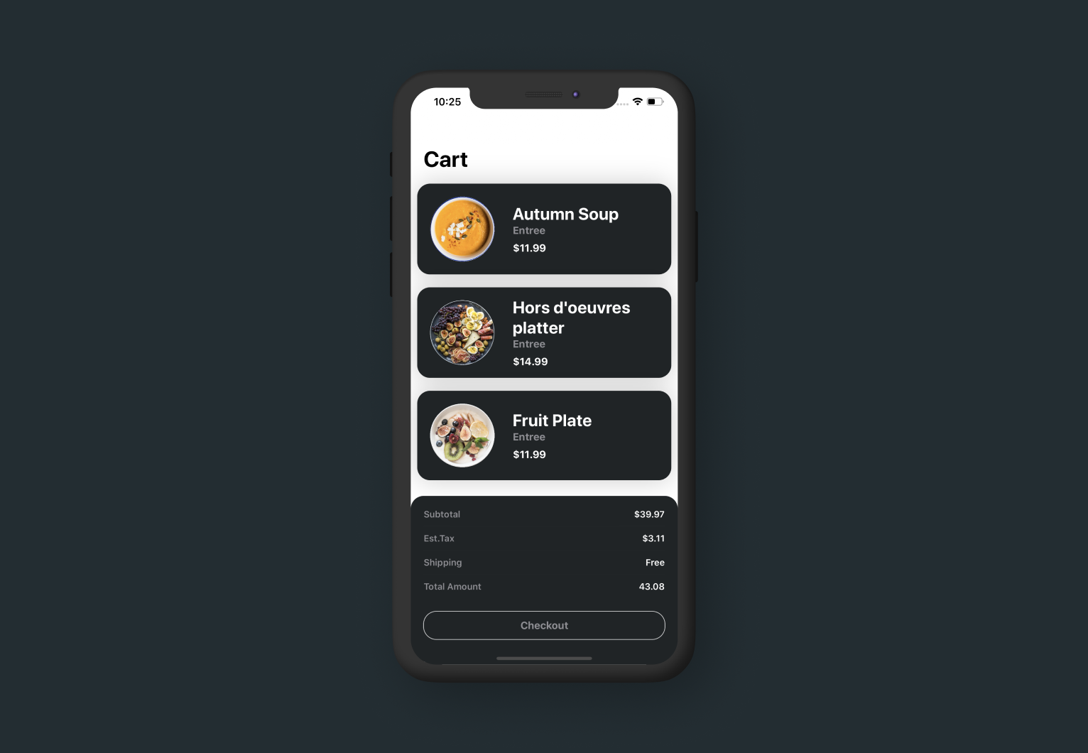
Below you'll see the code for a basic product card. It has four pieces of data: image, title, type, and price. For the images: I simply cropped the images in Figma using a circle mask to get the final product which is shown on the row.
struct ProductCard: View {

    var image: String
    var title: String
    var type: String
    var price: Double

    var body: some View {
        HStack(alignment: .center) {
            Image(image)
                .resizable()
                .aspectRatio(contentMode: .fit)
                .frame(width: 100)
                .padding(.all, 20)

            VStack(alignment: .leading) {
                Text(title)
                    .font(.system(size: 26, weight: .bold, design: .default))
                    .foregroundColor(.white)
                Text(type)
                    .font(.system(size: 16, weight: .bold, design: .default))
                    .foregroundColor(.gray)
                HStack {
                    Text("$" + String.init(format: "%0.2f", price))
                        .font(.system(size: 16, weight: .bold, design: .default))
                        .foregroundColor(.white)
                        .padding(.top, 8)
                }
            }.padding(.trailing, 20)
            Spacer()
        }
        .frame(maxWidth: .infinity, alignment: .center)
        .background(Color(red: 32/255, green: 36/255, blue: 38/255))
        .modifier(CardModifier())
        .padding(.all, 10)
    }
}
Example Use

ProductCard(image: "Product_1", title: "Autumn Soup", price: 11.99)Show us what you've made!
We want to see what you've made using this tutorial! Send us pics! Find us on Twitter @TrailingClosure, on Instagram, or email us at [email protected].