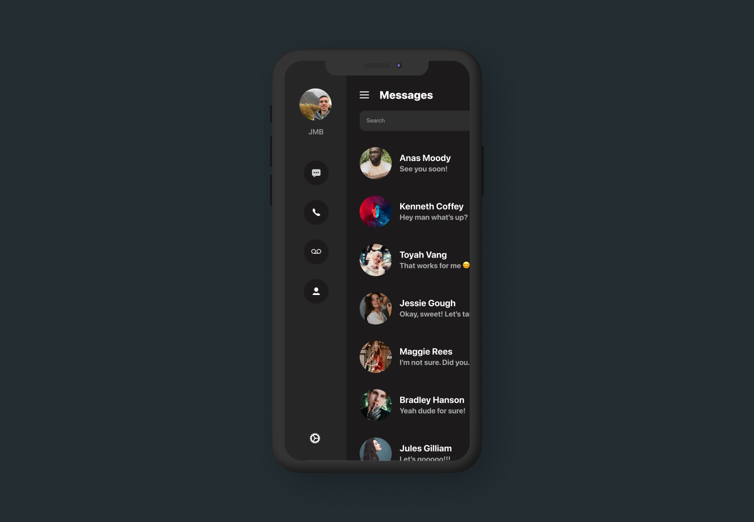
Today I decided to mess around with creating a SwiftUI View which allows me to easily create a sidebar menu for content inside my apps. After designing a few prototypes, I generalized it into a single custom view class called SideBarStack as shown below.
If you found this tutorial helpful, please consider subscribing using this link, and if you aren't reading this on TrailingClosure.com, please come check us out sometime!
struct SideBarStack<SidebarContent: View, Content: View>: View {

    let sidebarContent: SidebarContent
    let mainContent: Content
    let sidebarWidth: CGFloat
    @Binding var showSidebar: Bool

    init(sidebarWidth: CGFloat, showSidebar: Binding<Bool>, @ViewBuilder sidebar: ()->SidebarContent, @ViewBuilder content: ()->Content) {
        self.sidebarWidth = sidebarWidth
        self._showSidebar = showSidebar
        sidebarContent = sidebar()
        mainContent = content()
    }

    var body: some View {
        ZStack(alignment: .leading) {
            sidebarContent
                .frame(width: sidebarWidth, alignment: .center)
                .offset(x: showSidebar ? 0 : -1 * sidebarWidth, y: 0)
                .animation(Animation.easeInOut.speed(2))
            mainContent
                .overlay(
                    Group {
                        if showSidebar {
                            Color.white
                                .opacity(showSidebar ? 0.01 : 0)
                                .onTapGesture {
                                    self.showSidebar = false
                                }
                        } else {
                            Color.clear
                            .opacity(showSidebar ? 0 : 0)
                            .onTapGesture {
                                self.showSidebar = false
                            }
                        }
                    }
                )
                .offset(x: showSidebar ? sidebarWidth : 0, y: 0)
                .animation(Animation.easeInOut.speed(2))

        }
    }
}
As you can see, the custom view utilizes the @ViewBuilder Property Wrapper twice to allow you to pass in custom content for both the Sidebar and actual view content.
The custom SideBarStack also takes in two parameters: sidebarWidth and showSidebar. The first allows the view to translate both the sidebar and main content correctly when the sidebar opens and closes. It's as simple as setting the offset of the two views according to the passed in width.
Second the showSidebar bool controls whether or not the sidebar is open. It's passed in as a @Binding to allow a TapGesture be placed on the main content. This allows a user to tap the main content to close the sidebar and not just the menu button. In the code, this works by applying an almost completely clear overlay. SwiftUI will not trigger the tap gesture on a Color.clear view or a view whose opacity is 0.
Example Use
struct ContentView: View {

    // Controls display of sidebar
    @State var showSidebar: Bool = false

    var body: some View {
        SideBarStack(sidebarWidth: 125, showSidebar: $showSidebar) {
           // Sidebar content here
        } content: {
           // Main content here
        }.edgesIgnoringSafeArea(.all)
    }
}
Like this tutorial?
Show us what you've made!
Send us pics! Drop us a link! Anything! Find us on Twitter @TrailingClosure, on Instagram, or email us at [email protected].