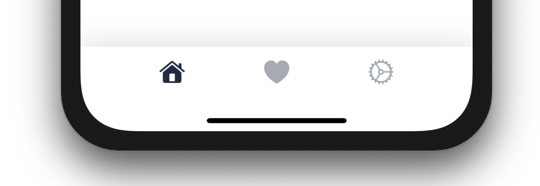
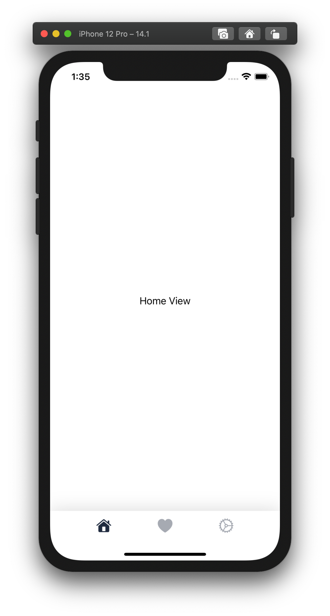
Here's an easy quick tip for this week. Have you ever wanted to customize the TabView's TabBar in SwiftUI? Don't reinvent the component from scratch. The method I show below simply uses the native TabView in SwiftUI and overlays your custom TabBar component on top. Your component will handle the user taps and selections by passing them on to the native TabView via its selection parameter. See below for how it's done!
If you found this tutorial helpful, please consider subscribing using this link, and if you aren't reading this on TrailingClosure.com, please come check us out sometime!
struct RootView: View {

    // Hold the state for which tab is active/selected
    @State var selection: Int = 0

    var body: some View {

        // Your native TabView here
        TabView(selection: $selection) {
            HomeTab()
                .tag(0)

            FavoritesTab()
                .tag(1)

            SettingsTab()
                .tag(2)
        }
        .overlay( // Overlay the custom TabView component here
            Color.white // Base color for Tab Bar
                .edgesIgnoringSafeArea(.vertical)
                .frame(height: 50) // Match Height of native bar
                .overlay(HStack {
                    Spacer()

                    // First Tab Button
                    Button(action: {
                        self.selection = 0
                    }, label: {
                        Image(systemName: "house.fill")
                            .resizable()
                            .aspectRatio(contentMode: .fit)
                            .frame(width: 25, height: 25, alignment: .center)
                            .foregroundColor(Color(red: 32/255, green: 43/255, blue: 63/255))
                            .opacity(selection == 0 ? 1 : 0.4)
                    })
                    Spacer()

                    // Second Tab Button
                    Button(action: {
                        self.selection = 1
                    }, label: {
                        Image(systemName: "heart.fill")
                            .resizable()
                            .aspectRatio(contentMode: .fit)
                            .frame(width: 25, height: 25, alignment: .center)
                            .foregroundColor(Color(red: 32/255, green: 43/255, blue: 63/255))
                            .opacity(selection == 1 ? 1 : 0.4)
                    })

                    Spacer()

                    // Third Tab Button
                    Button(action: {
                        self.selection = 2
                    }, label: {
                        Image(systemName: "gear")
                            .resizable()
                            .aspectRatio(contentMode: .fit)
                            .frame(width: 25, height: 25, alignment: .center)
                            .foregroundColor(Color(red: 32/255, green: 43/255, blue: 63/255))
                            .opacity(selection == 2 ? 1 : 0.4)
                    })
                    Spacer()

                })
        ,alignment: .bottom) // Align the overlay to bottom to ensure tab bar stays pinned.
    }
}
Like this tutorial?
Show us what you've made!
Send us pics! Drop us a link! Anything! Find us on Twitter @TrailingClosure, on Instagram, or email us at [email protected].