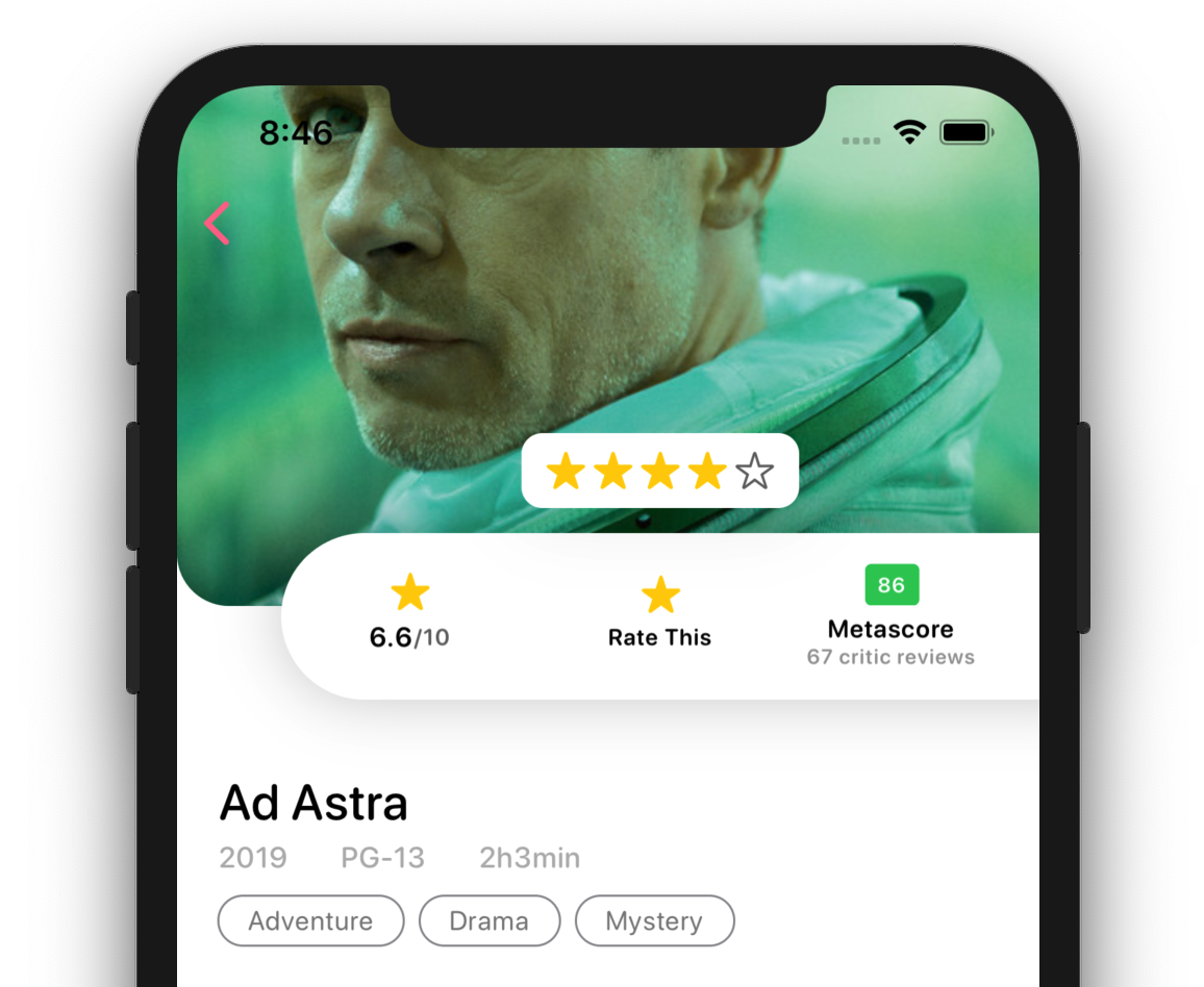
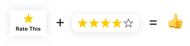
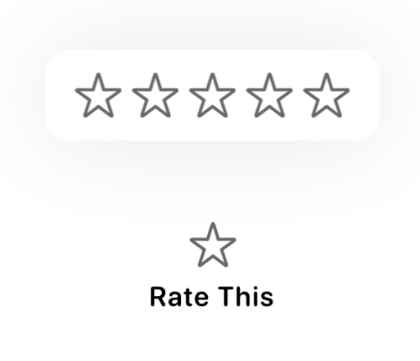
Here's a quick look at what we'll be creating today. At the end of this tutorial you'll be able to use this Popup Review Button in your app to have users rate anything your app has to offer.
Before getting started, please consider subscribing using this link, and if you aren't reading this on TrailingClosure.com, please come check us out sometime!
Getting Started
Create a new SwiftUI File named ReviewButton to generate a template to get us started. This is the view that's going to tie everything together. We'll add this to our app once we're finished building the button.
import SwiftUI

struct ReviewButton: View {
    var body: some View {
        Text("Hello, World!")
    }
}

struct ReviewButton_Previews: PreviewProvider {
    static var previews: some View {
        ReviewButton()
    }
}
Decomposing Our View
The way we're going to break this ReviewButton down is in to two parts. The first being the Star Image and "Rate This" Text, and the second being the popup of 5 stars.
Clearly stars are going to be coming up a lot in this project so let's go ahead and create one to our advantage.
StarIcon
-
Create another SwiftUI View named
StarIcon -
Add a property variable for the star being filled (or not).
var filled: Bool = false -
Remove the template code and replace with an
Imagethat shows a star. The rucial point here is changing whether we use thestar.fillorstaricon provided by the system. We'll use the property we just defined to decide.Image(systemName: filled ? "star.fill" : "star")If you're not familiar with the ternary conditional operator used above, checkout Apple's documentation on it here
-
Then we'll color the Star Icon based on whether or not it's filled in.
Image(systemName: filled ? "star.fill" : "star")
    .foregroundColor(filled ? Color.yellow : Color.black.opacity(0.6))
Here's all of it put together.
import SwiftUI

struct RatingIcon: View {

    var filled:Bool = true

    var body: some View {
        Image(systemName: filled ? "star.fill" : "star")
            .foregroundColor(filled ? Color.yellow : Color.black.opacity(0.6))
    }
}

struct RatingIcon_Previews: PreviewProvider {
    static var previews: some View {
        RatingIcon(filled: true)
    }
}
Now to put those Stars to work!
Like I said earlier, we're going to create the Star and Laabel first, then the Popup.
Head back to ReviewButton and let's get started on the fifrst part.
-
Replace the
Textwith aButton. After all that's what we're creating right?? Leave the action empty for now, but go ahead and add a VStack as the root view in theButtoncontent.Button(action: { // Empty for now... }) { VStack(alignment: .center, spacing: 8) { //Star Icon and Label Here... } } -
Add our
StarIconin theVStackand then aTextwith the string "Rate This". Change the color to black as well as the default font as such.VStack(alignment: .center, spacing: 8) { //Star Icon and Label Here... StarIcon() Text("Rate This") .foregroundColor(Color.black) .font(Font.system(size: 11, weight: .semibold, design: .rounded)) } -
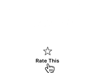
Preview the View in the canvas, and you should have a view which looks like this.
Creating The Popup
Now we're going to create the popup that shows the group of 5 stars. We're going to re-use our StarIcon we created earlier.
-
Inside the
RatingButtonview add an overlay on top of theButtonlike so.Button(action: { // Empty for now... }) { VStack(alignment: .center, spacing: 8) { //Star Icon and Label Here... StarIcon() Text("Rate This") .foregroundColor(Color.black) .font(Font.system(size: 11, weight: .semibold, design: .rounded)) } }.overlay( /* Star Icons Here */ ) -
Using an
HStackplace fiveStarIcons together. Make sure the alignment is in the center, and thatHStackis using a spacing value of 4..overlay( HStack(alignment: .center, spacing: 4) { RatingIcon(filled: false) RatingIcon(filled: false) RatingIcon(filled: false) RatingIcon(filled: false) RatingIcon(filled: false) } ) -
Now let's style our popup a bit by adding some padding, a background, curved corners, and a drop shadow.
.overlay( HStack(alignment: .center, spacing: 4) { RatingIcon(filled: false) RatingIcon(filled: false) RatingIcon(filled: false) RatingIcon(filled: false) RatingIcon(filled: false) } // Start styling the popup... .padding(.all, 12) .background(Color.white) .cornerRadius(10) .shadow(color: Color.black.opacity(0.1), radius: 20, x: 0, y: 0) ) -
Now offset the popup upwards so it's not directly on top of the button.
.overlay(
   HStack(alignment: .center, spacing: 4) {
       RatingIcon(filled: false)
       RatingIcon(filled: false)
       RatingIcon(filled: false)
       RatingIcon(filled: false)
       RatingIcon(filled: false)
   }
   .padding(.all, 12)
   .background(Color.white)
   .cornerRadius(10)
   .shadow(color: Color.black.opacity(0.1), radius: 20, x: 0, y: 0)
   .offset(x: 0, y: -70) // Move the view above the button
)
Displaying the Popup
Next we need to hide the popup until the button is tapped. Add a bool property to ReviewButton which will control the state of the popup.
@State var popupOpen:Bool = false
Now head back down to the Button we declared earlier. Add in this snippet to the action parameter.
Button(action: {
    withAnimation { self.popupOpen = !self.popupOpen }
})
Then add this code to your HStack inside the overlay in order to adjust the opacity. You should place it just below where we set the offset of the overlay.
.opacity(popupOpen ? 1.0 : 0)
Now go ahead and try it out in the Canvas view or in your emulator.
Making Those Stars Gold! (Adding Review Feature)
Next we need to start coloring those stars based off of what the user rates. In order to track this add a property to track the star rating.
@State var stars:Int = 0
We'll use this property to color in the star on the button as well as the popup. Let's modify our code to reflect this.
- Change the
StarIconinside theButtonto change to yellow if the current star rating is greater than0.
// Inside the Button
VStack(alignment: .center, spacing: 8) {
    //Star Icon and Label Here...
    StarIcon(filled: stars > 0)
    // "Rate This" Label Below
- Modify the
StarIcons inside the popup overlay to change color as well.
HStack(alignment: .center, spacing: 4) {
    RatingIcon(filled: stars > 0)
    RatingIcon(filled: stars > 1)
    RatingIcon(filled: stars > 2)
    RatingIcon(filled: stars > 3)
    RatingIcon(filled: stars > 4)
}
Now that the StarIcons will change color as the rating changes, we need to actually allow the user to select a rating. We're going to use a DragGesture to achieve this.
Just below where we declared the popupOpen and stars property, create a DragGesture. Set the minimumDistance to 0 and coordinateSpace to .local.
By setting the minimum distance to
0it allows theDragGestureto recognize taps and not just dragging gestures.
var gesture: some Gesture {
    return DragGesture(minimumDistance: 0, coordinateSpace: .local)
        .onChanged({ val in
            // Update Rating Here
        })
        .onEnded { val in
           // Update Rating Here
        }
}
Finally, the last thing to do is calculate how many stars have been selected based on the x location of the user's tap or drag.
Declare a closure above where you return the DragGesture and have it take in a CGFloat for the x position. Then we'll do some quick math to determine which StarIcon the user selected and update the state.
let updateRating: (CGFloat)->() = { x in
    let percent = max((x / 110.0), 0.0)
    self.stars = min(Int(percent * 5.0) + 1, 5)
}
Then call the function in the onChanged and onEnded functions we setup earlier.
You'll notice I also added an animation in there to close the popup after the user selected their rating.
return DragGesture(minimumDistance: 0, coordinateSpace: .local)
.onChanged({ val in
    updateRating(val.location.x)
})
.onEnded { val in
    updateRating(val.location.x)
    DispatchQueue.main.asyncAfter(deadline: .now() + 0.1) {
        withAnimation {
            self.popupOpen = false
        }
    }
}
The last thing to do is add the gesture to our popup! Simply add this code directly after you declare the HStack like this.
HStack(alignment: .center, spacing: 4) {
    RatingIcon(filled: stars > 0)
    RatingIcon(filled: stars > 1)
    RatingIcon(filled: stars > 2)
    RatingIcon(filled: stars > 3)
    RatingIcon(filled: stars > 4)
}
.gesture(dragGesture)
The Final Product!
Support Future Tutorials
If you enjoyed this tutorial, please consider subscribing to my website using this link. Our subscribers get access to our exclusive content just by signing up. Oh and if you aren't reading this on TrailingClosure.com, please come check us out sometime!
Disclaimer
The Movie Posters used in the examples are not mine and are used as examples only. They are not to be used in any commercial project without the consent of the owner.